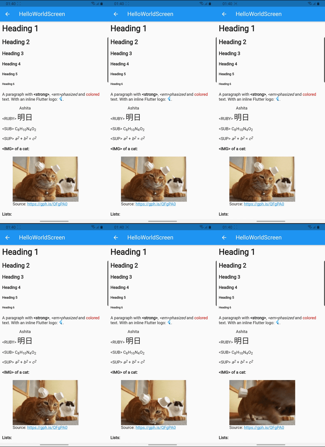
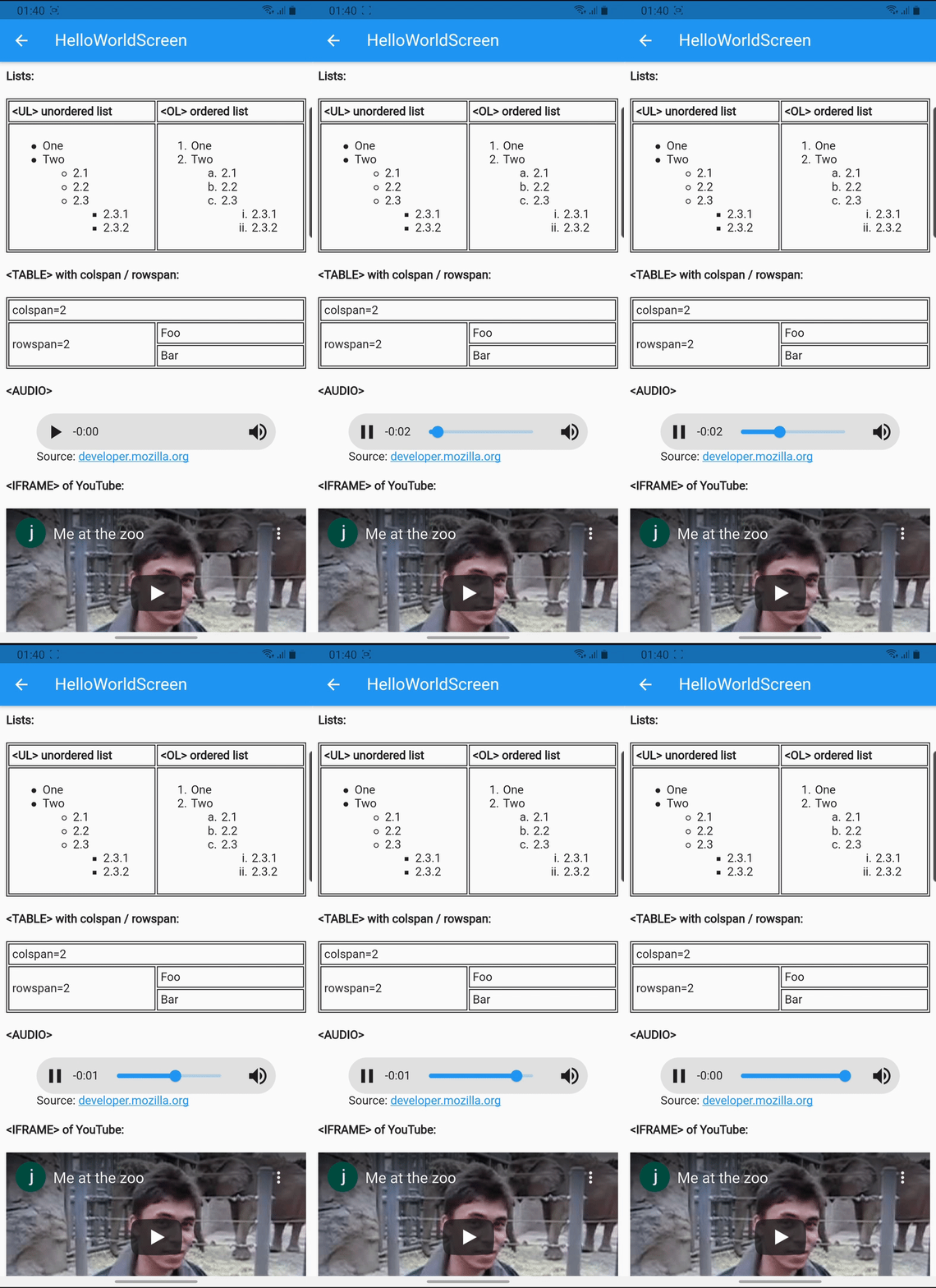
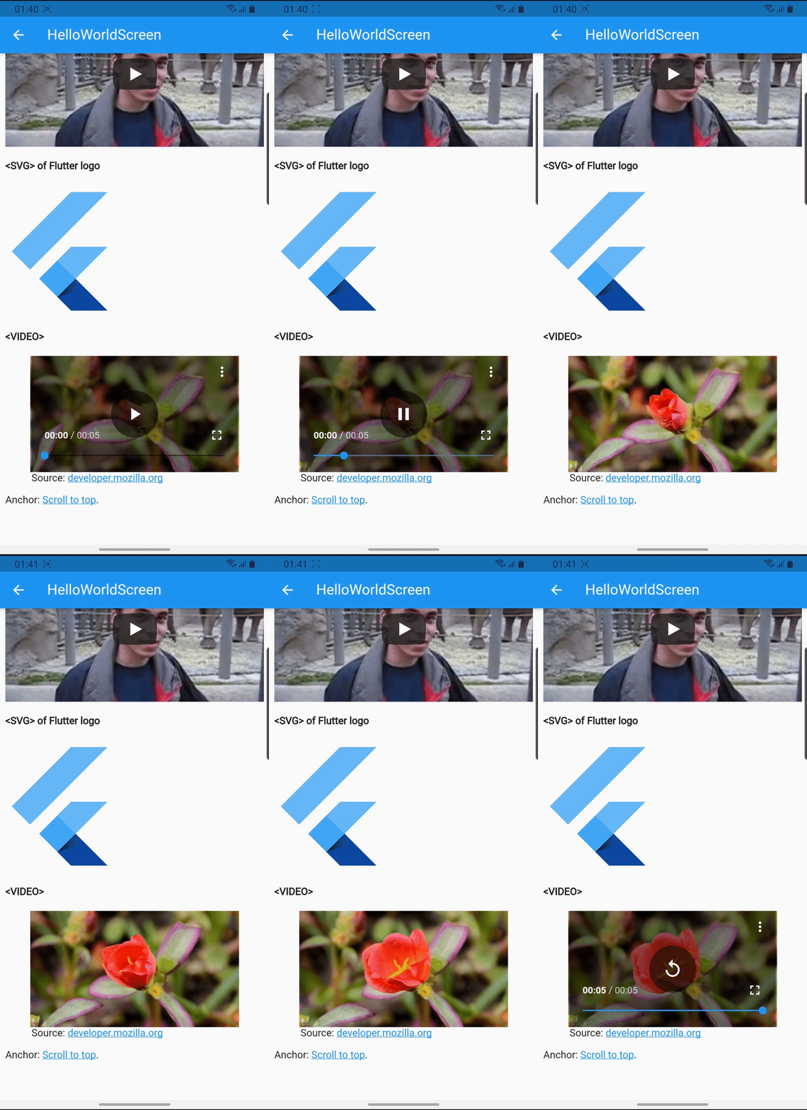
Flutter package to render html as widgets that supports hyperlink, image, audio, video, iframe and 70+ other tags.
| Live demo | ||
|---|---|---|
 |
 |
 |
This package supports most common HTML tags for easy usage. If you don't want to include all of its dependencies in your build, it's possible to use flutter_widget_from_html_core with a subset of the mixins to control your app size:
- fwfh_cached_network_image for optimized image rendering
- fwfh_chewie for VIDEO support
- fwfh_just_audio for AUDIO support
- fwfh_svg for SVG support
- fwfh_url_launcher to launch URLs
- fwfh_webview for IFRAME support
Add this to your app's pubspec.yaml file:
dependencies:
flutter_widget_from_html: ^0.15.3This package uses just_audio to play audio and this dependency uses a microphone API.
By default, the App Store requires a usage description which can be skipped by editing your ios/Podfile.
See the detailed instruction on its pub.dev page.
If you don't need AUDIO tag support (e.g. your HTML never has that tag), it may be better to switch to
the core package and use it with a subset of the mixins. See Extensibility for more details.
Then you have to import the package with:
import 'package:flutter_widget_from_html/flutter_widget_from_html.dart';And use HtmlWidget where appropriate:
HtmlWidget(
  // the first parameter (`html`) is required
  '''
  <h3>Heading</h3>
  <p>
    A paragraph with <strong>strong</strong>, <em>emphasized</em>
    and <span style="color: red">colored</span> text.
  </p>
  ''',

  // all other parameters are optional, a few notable params:

  // specify custom styling for an element
  // see supported inline styling below
  customStylesBuilder: (element) {
    if (element.classes.contains('foo')) {
      return {'color': 'red'};
    }

    return null;
  },

  customWidgetBuilder: (element) {
    if (element.attributes['foo'] == 'bar') {
      // render a custom block widget that takes the full width
      return FooBarWidget();
    }

    if (element.attributes['fizz'] == 'buzz') {
      // render a custom widget inline with surrounding text
      return InlineCustomWidget(
        child: FizzBuzzWidget(),
      )
    }

    return null;
  },

  // this callback will be triggered when user taps a link
  onTapUrl: (url) => print('tapped $url'),

  // select the render mode for HTML body
  // by default, a simple `Column` is rendered
  // consider using `ListView` or `SliverList` for better performance
  renderMode: RenderMode.column,

  // set the default styling for text
  textStyle: TextStyle(fontSize: 14),
),Below tags are the ones that have special meaning / styling, all other tags will be parsed as text. Compare between Flutter rendering and browser's.
- A: underline, theme accent color
- Scroll to anchor
- Launch URL via url_launcher with base URL resolver
- AUDIO via just_audio
- H1/H2/H3/H4/H5/H6
- IFRAME via webview_flutter
- IMG with support for asset (
asset://), data uri, local file (file://) and network image via cached_network_image. Additional .svg file support via flutter_svg. - LI/OL/UL with support for:
- Attributes:
type,start,reversed - Inline style
list-style-typevalues:lower-alpha,upper-alpha,lower-latin,upper-latin,circle,decimal,disc,lower-roman,upper-roman,square
- Attributes:
- TABLE/CAPTION/THEAD/TBODY/TFOOT/TR/TD/TH with support for:
- TABLE attributes
border,cellpadding,cellspacing - TD/TH attributes
colspan,rowspan,valign - Table is scrollable if columns are too wide
- TABLE attributes
- SVG via flutter_svg
- VIDEO via chewie
- ABBR, ACRONYM, ADDRESS, ARTICLE, ASIDE, B, BIG, BLOCKQUOTE, BR, CENTER, CITE, CODE, DD, DEL, DETAILS, DFN, DIV, DL, DT, EM, FIGCAPTION, FIGURE, FONT, FOOTER, HEADER, HR, I, INS, KBD, MAIN, MARK, NAV, NOSCRIPT, P, PRE, Q, RP, RT, RUBY, S, SAMP, SECTION, SMALL, STRIKE, STRONG, STYLE, SUB, SUMMARY, SUP, TT, U, VAR
- Everything with screenshot: https://demo.fwfh.dev/supported/tags.html
- Try with fwfh.dev
These tags and their contents will be ignored:
- SCRIPT
- STYLE
- align: center/end/justify/left/right/start/-moz-center/-webkit-center
- dir: auto/ltr/rtl
- background: 1 value (color)
- background-color:
currentcolor, hex values,rgb(),hsl()or named colors - background-image:
url()with support for asset (asset://), data uri, local file (file://) and network image - background-repeat: no-repeat/repeat/repeat-x/repeat-y
- background-position: single or double instances of bottom/center/left/right/top (e.g.
top left) - background-size: auto/contain/cover
- background-color:
- border: 3 values (width style color), 2 values (width style) or 1 value (width)
- border-top, border-right, border-bottom, border-left
- border-block-start, border-block-end
- border-inline-start, border-inline-end
- border-radius: 4, 3, 2 or 1 value with slash support (e.g.
10px / 20px)- border-top-left-radius: 2 values or 1 value in
em,ptandpx - border-top-right-radius: 2 values or 1 value in
em,ptandpx - border-bottom-right-radius: 2 values or 1 value in
em,ptandpx - border-bottom-left-radius: 2 values or 1 value in
em,ptandpx
- border-top-left-radius: 2 values or 1 value in
- color: hex values,
rgb(),hsl()or named colors - direction (similar to
dirattribute) - display: block/flex/inline/inline-block/none
- In
flexmode:- flex-direction: column/row
- align-items: flex-start/flex-end/center/baseline/stretch
- justify-content: flex-start/flex-end/center/space-between/space-around/space-evenly
- In
- font-family
- font-size: absolute (e.g.
xx-large), relative (larger,smaller) or values inem,%,ptandpx - font-style: italic/normal
- font-weight: bold/normal/100..900
- line-height:
normal, number or values inem,%,ptandpx - margin: 4 values, 2 values or 1 value in
em,ptandpx- margin-top, margin-right, margin-bottom, margin-left
- margin-block-start, margin-block-end
- margin-inline-start, margin-inline-end
- padding: 4 values, 2 values or 1 value in
em,ptandpx- padding-top, padding-right, padding-bottom, padding-left
- padding-block-start, padding-block-end
- padding-inline-start, padding-inline-end
- vertical-align: baseline/top/bottom/middle/sub/super
- text-align (similar to
alignattribute) - text-decoration
- text-decoration-color:
currentcolor, hex values,rgb(),hsl()or named colors - text-decoration-line: line-through/none/overline/underline
- text-decoration-style: dotted/dashed/double/solid
- text-decoration-thickness, text-decoration-width: values in
%only
- text-decoration-color:
- text-overflow: clip/ellipsis. Note:
text-overflow: ellipsisshould be used in conjuntion withmax-linesor-webkit-line-clampfor better result. - text-shadow:
- 4 values (color x y blur, color x y blur)
- 3 values (x y color, color x y)
- Or 2 values (x y)
- Multiple shadows
- white-space: pre/normal/nowrap
- Sizing:
autoor values inem,%,ptandpx- width, max-width, min-width
- height, max-height, min-height
The core package implements widget building logic with high testing coverage to ensure correctness. It tries to render an optimal tree by using RichText with specific TextStyle, merging text spans together, showing images in sized box, etc. The idea is to build a solid foundation for apps to customize.
See the extensibility document for detailed information.
