A basic button component that is looking good on any platform. This react native button is ready to handle most used scenarios which will enable you to build apps faster with cleaner code.

Imports:
import { Button } from 'galio-framework';
Code example:
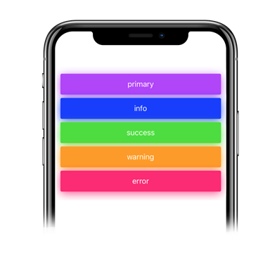
<Button>primary</Button>
<Button color="info">info</Button>
<Button color="success">success</Button>
<Button color="warning">warning</Button>
<Button color="error">error</Button>
Code example:
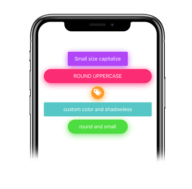
<Button capitalize size="small">small size capitalize</Button>
<Button round uppercase color="error">round uppercase</Button>
<Button onlyIcon icon="tags" iconFamily="antdesign" iconSize={30} color="warning" iconColor="#fff" style={{ width: 40, height: 40 }}>warning</Button>
<Button color="#50C7C7" shadowless>custom color and shadowless</Button>
<Button round size="small" color="success">round and small</Button>| Prop | Type | Default | Description |
|---|---|---|---|
| ...TouchableOpacity.propTypes | |||
| capitalize | bool | false | Transforms the first character in a capital letter |
| color | string | 'primary' | your options are: 'primary', 'theme', 'error', 'warning', 'succes', 'transparent' or your own color |
| disabled | bool | false | Disables the button |
| icon | bool, string | false | pick whatever icon you want from Expo's icons |
| iconColor | bool, string | theme.COLORS.BLACK | sets the icon's color |
| iconFamily | bool, string | false | pick whatever icon family suits the icon you chose from Expo's icons |
| iconSize | number | 14 | sets the icon's size |
| loading | bool | false | Uses the for the loading effect |
| loadingSize | string | 'small' | your options are: 'small', 'large' |
| lowercase | bool | false | makes all letters lowercase |
| onlyIcon | bool | false | adds specific styling for using only an icon in your button |
| opacity | number | 0.8 | changes the button's opacity |
| radius | number | 0 | changes the button's radius |
| shadowColor | bool, string | false | the default shadowColor is based on the button's color but you can also write a specific shadowColor |
| shadowless | bool | false | removes shadow |
| size | number | 'large' | your options are: 'large', 'small' |
| uppercase | bool | false | makes all letters uppercase |