Checkboxes allow users to complete tasks that involve making choices such as selecting options, or switching settings on or off. Using the onChange function will enable you to call a function when the state value changes, so basically whenever the user is tapping the Checkbox.
Imports:
import { Checkbox } from 'galio-framework';
Code example:
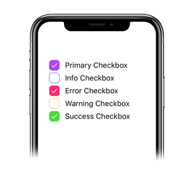
<Checkbox color="primary" label="Primary Checkbox" />
<Checkbox color="info" label="Info Checkbox" />
<Checkbox color="error" label="Error Checkbox" />
<Checkbox color="warning" label="Warning Checkbox" />
<Checkbox color="success" label="Success Checkbox" />
Code example:
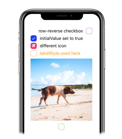
<Checkbox color="primary" flexDirection="row-reverse" label="row-reverse checkbox" />
<Checkbox color="info" initialValue={true} label="initialValue set to true" />
<Checkbox color="error" initialValue={true} label="different icon" iconFamily="font-awesome" iconName="plane" />
<Checkbox color="warning" labelStyle={{ color: '#FF9C09' }} label="labelStyle used here" />
<Checkbox color="success" image="https://images.unsplash.com/photo-1569780655478-ecffea4c165c?ixlib=rb-1.2.1" flexDirection="column-reverse"/>
<p align="center"> <img src="https://raw.githubusercontent.com/galio-org/docs/master/assets/checkbox_onChange.gif" alt="Checkbox advanced onChange example react native" />
Code example:
<Checkbox color="warning" onChange={() => alert('Galio is cool')} label="onChange is here" />| Prop | Type | Default | Description |
|---|---|---|---|
| checkboxStyle | any | null | By sending an object you can style the checkbox's color, size and more. |
| disabled | bool | false | This disables the possibility of the checkbox being used. |
| flexDirection | oneOf(['row', 'row-reverse', 'column', 'column-reverse']), string | 'row' | Maybe you need the checkbox to be on top of an image? You can do that with this prop. |
| iconColor | string | '#fff' | This prop changes the icon color. |
| iconName | string | 'check' | This prop changes the icon. |
| iconSize | number | 15 | This prop changes the size of the icon. |
| iconFamily | string | 'FontAwesome' | In case you need an icon from a different package, this prop helps you change the icon package. |
| image | string | null | This allows you to place an image instead of text. |
| imageStyle | any | null | Style the way your image looks here! |
| initialValue | bool | false | Should the initial state of your checkbox be false or true? |
| label | string | null | The text next to your checkbox. |
| labelStyle | any | null | Style your checkbox's text. |
| onChange | function | () => {} | This prop take an arrow function and everytime the user presses the checkbox the function is called. |