- implement ReactDom.Portal in React Native.
- multiple portalhost support.
- programmatically create components and support refresh.
- position configurable for dynamic components, e.g. center,bottom,top,auto.
- support for Confirm Dialog out of box.
- install package
npm install rn-portal-confirm --save
- Add the PortalProvider in the Entry Component, e.g App.
// assume we are in render function of App, Wrapper children under PortalProvider
<PortalProvider>
xxx
</PortalProvider>- Add any PortalHost if needed, elements will be ported under this host. By default, we will create a root Portalhost in the PortalProvider. so you can skip this step, if single portalHost can match your requirement.
<PortalHost name='xxxuniquename'></PortalHost>for detail examples, please refer to the example in the source code. Bellow give two classic usage.
call API to create confirm dialog before your process
import {useConfirm} from 'rn-portal-confirm';
const confirm = useConfirm();
confirm({
      message: 'Are you sure to do something?',
      ok: (closeMe)=>{dosomething();closeMe();},
      cancel: (closeMe) => closeMe(),
});- useConfirm(portalHost?: string):confirm
| Parameter | Description | defaultValue |
|---|---|---|
| portalHost | the PortalHost Name in which the elements will be ported | by default it is the rootPortal |
confirm(param:ConfirmProps):[close,update];
export interface ConfirmProps {
  title?: ReactElement | string;
  message?: ReactElement | string;
  okText?: ReactElement | string;
  cancelText?: ReactElement | string;
  ok?: (closeMe: () => void) => void,
  cancel?: (closeMe: () => void) => void,
  dimissOnBackdropClick?: boolean;
  hideCancel?: boolean;
  Dialog?: (typeof React.Component<any>) | (React.FC<any>);
}

close:()=>void;
update:(props:ConfirmProps)=>void;
Here is the some definition of the ConfirmProps
| Parameter | Type | Description | defaultValue |
|---|---|---|---|
| dimissOnBackdropClick | boolean | indicate if the Confirm Dialog will be closed if drawback is clicked | false |
| hideCancel | boolean | indicate if the cancel button is hidden | false |
| Dialog | React Component | inidcate which Modal will be used to Modal the Confirm,we provide one similar like the Dialog Component in React-native-elements,you can change it if it can't match your requirements | underfined |
| title | stirng or ReactElement | the title of the confirm Dialog, you can provide a View if the default style can't match your requirements | null |
| message | string or ReactElement | the message of the confirm Dialog | null |
| okText | string or ReactElement | text of Ok Btn | Yes |
| cancelText | string or ReactElement | text of Cancel Btn | No |
| ok | function | callback function if ok button is clicked | underfined |
| cancel | function | callback function if cancel button is clicked | underfined |
we use useComponent to open a custom component in the Modal.
import { useComponent } from 'rn-portal-confirm';
const open = useComponent();

let componentRef: ReturnType<typeof open>;
const confirm = () => {
  componentRef?.close();
}
const component = (
      <View>
        <Text>Hello, I am a custom Component</Text>
        <View style={{ marginTop: 20 }}>
          <Button title='Close Me' onPress={confirm}></Button>
        </View>
      </View>
    );

componentRef = open(component);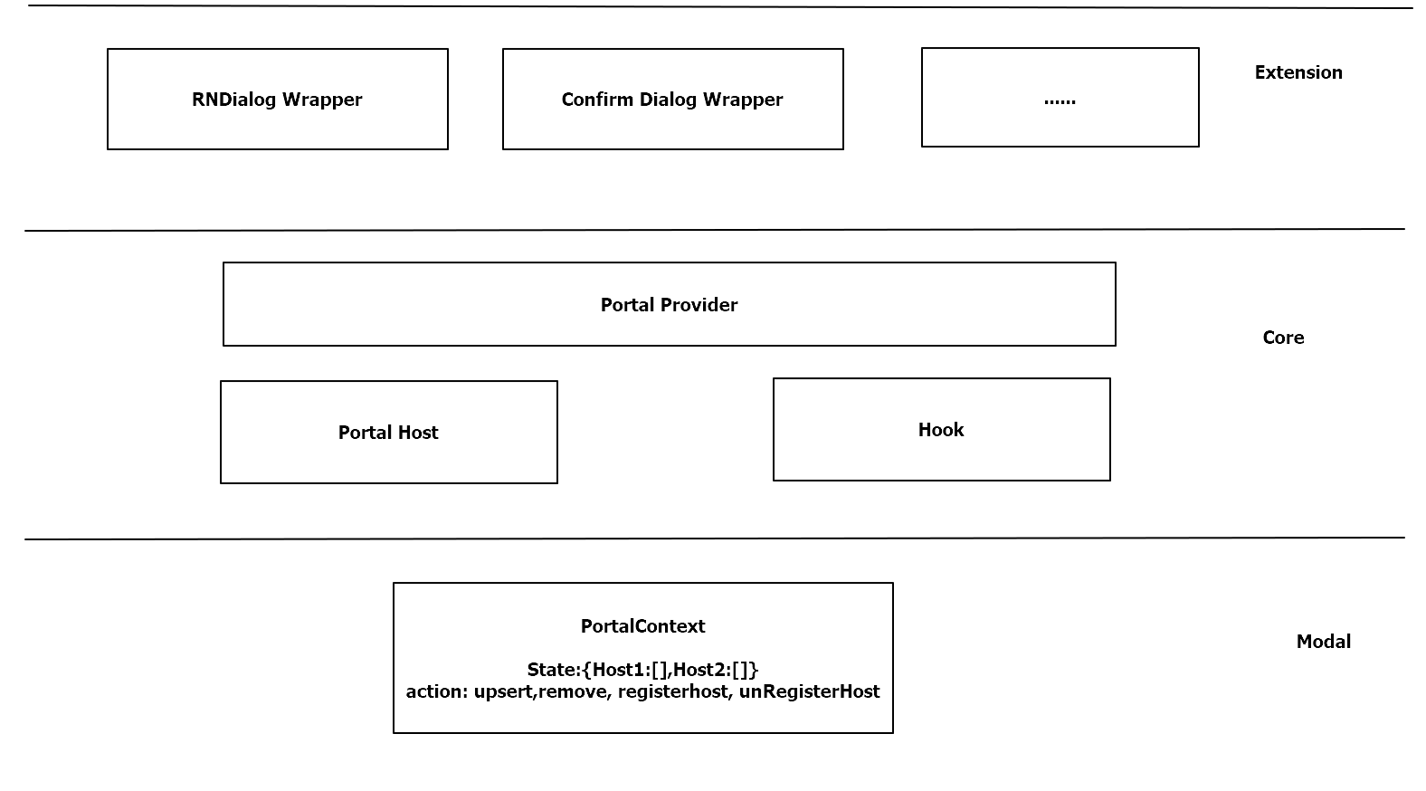
If you like this package, consider giving it a github star ⭐
Also, PR's are welcome!