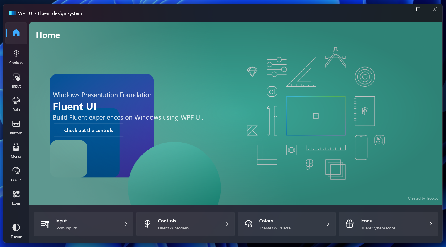
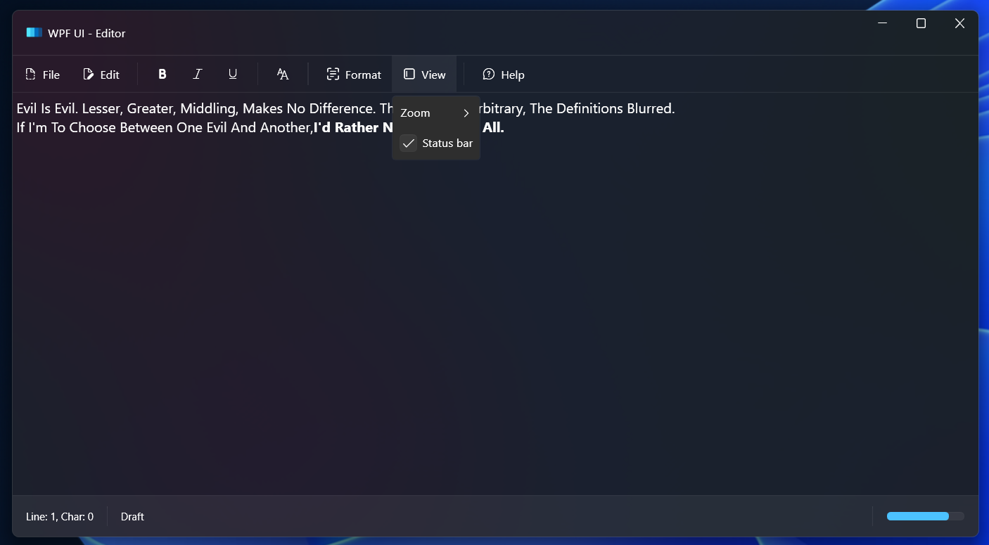
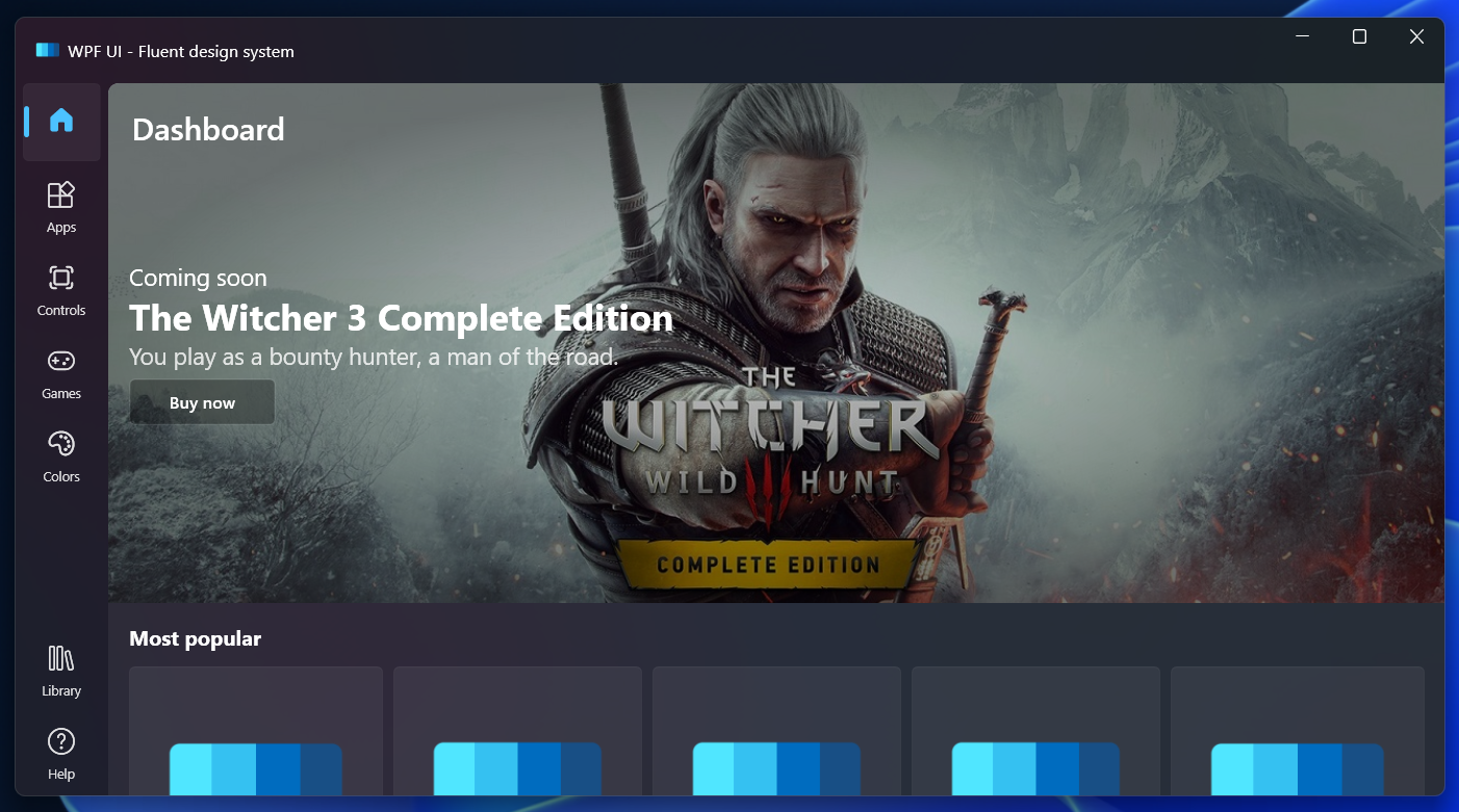
Created with ❤ in Poland by lepo.co
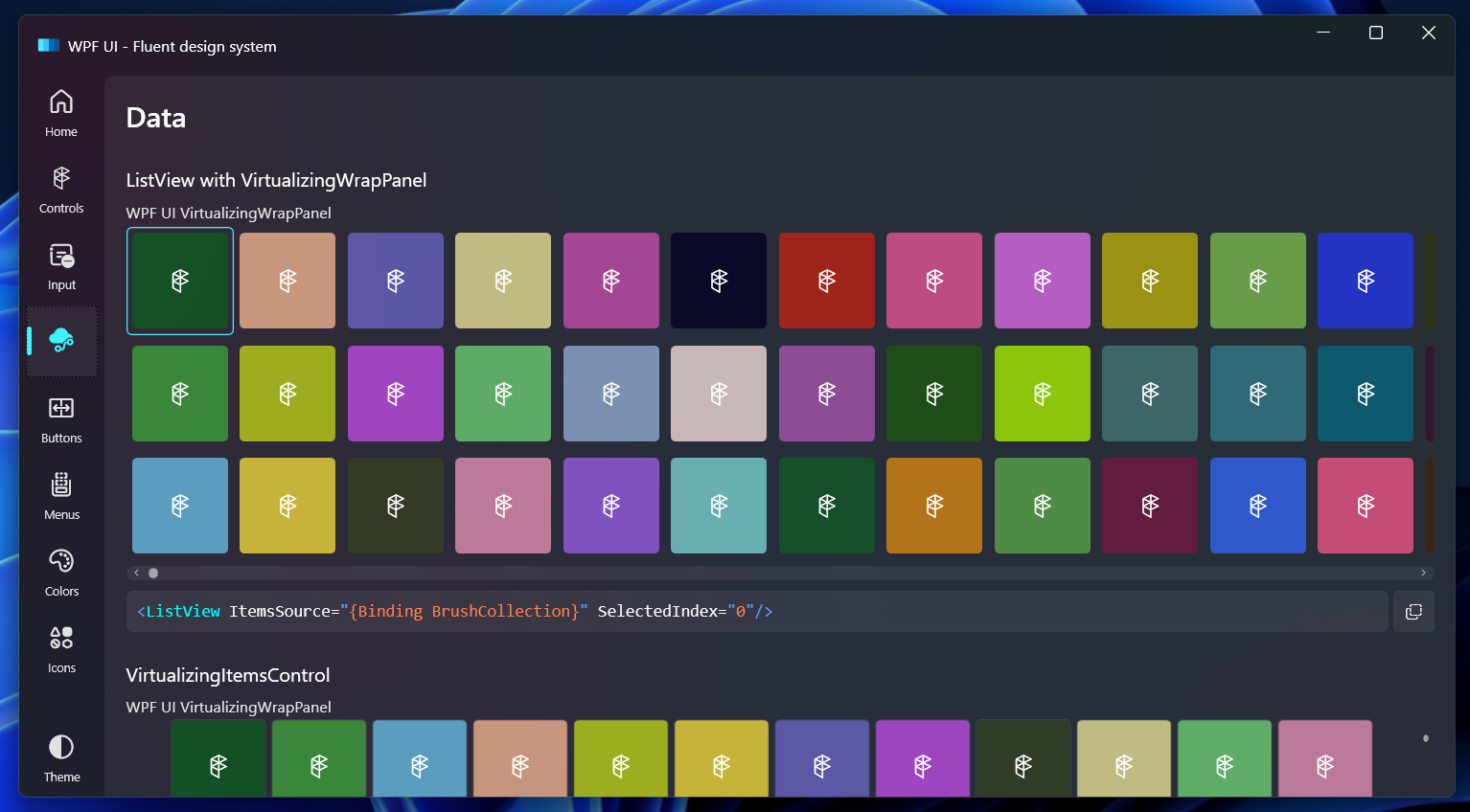
A simple way to make your application written in WPF keep up with modern design trends. Library changes the base elements like Page, ToggleButton or List, and also includes additional controls like Navigation, NumberBox, Dialog or Snackbar.
For a starter guide see our documentation.
WPF UI is delivered via NuGet package manager. You can find the package here:
https://www.nuget.org/packages/wpf-ui/
Visual Studio
The plugin for Visual Studio 2022 let you easily create new projects using WPF UI.
https://marketplace.visualstudio.com/items?itemName=lepo.wpf-ui
| Branch | Status |
|---|---|
| WPF UI - Main |  |
| WPF UI - Development |  |
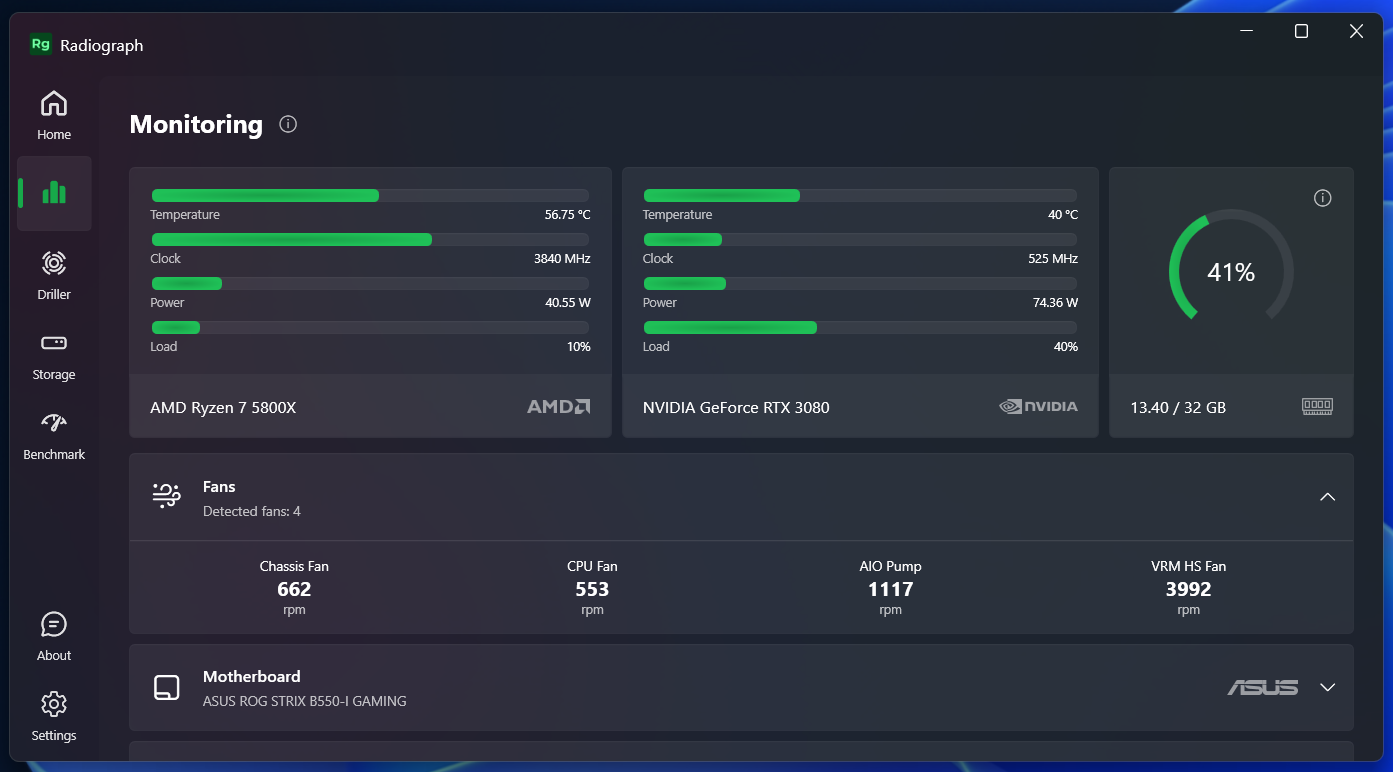
Radiograph is a computer hardware monitoring app that uses WPF UI.
| Control | Namespace | Description |
|---|---|---|
| UiWindow | Wpf.Ui.Controls | WPF window with additional features. |
| UiPage | Wpf.Ui.Controls | WPF page with additional features. |
| Anchor | Wpf.Ui.Controls | Creates a hyperlink to web pages, files or anything else a URL can address. |
| Arc | Wpf.Ui.Controls | Draws a symmetrical arc with rounded edges. |
| AutoSuggestBox | Wpf.Ui.Controls | Represents a text control that makes suggestions to users as they enter text using a keyboard. |
| Badge | Wpf.Ui.Controls | Used to highlight an item, attract attention or flag status. |
| Breadcrumb | Wpf.Ui.Controls | Automatic display of the page title from the navigation in the application. |
| Button | Wpf.Ui.Controls | Custom button with additional parameters like an icon. |
| Card | Wpf.Ui.Controls | Simple card compatible with the theme for displaying other elements. |
| CardAction | Wpf.Ui.Controls | Inherited from the Button interactive card styled according to Fluent Design. |
| CardControl | Wpf.Ui.Controls | Inherited from the Button control which displays an additional control on the right side of the card. |
| CardExpander | Wpf.Ui.Controls | Inherited from the ContentControl control which can hide the collapsable content. |
| CodeBlock | Wpf.Ui.Controls | Formats syntax and display a fragment of the source code. |
| Dialog | Wpf.Ui.Controls | Displays a large card with a slightly transparent background and two action buttons. |
| FontIcon | Wpf.Ui.Controls | Represents a text element containing an icon glyph with selectable font family. |
| Hyperlink | Wpf.Ui.Controls | Button that opens a URL in a web browser. |
| SymbolIcon | Wpf.Ui.Controls | Represents a text element containing an icon glyph. |
| MessageBox | Wpf.Ui.Controls | Custom window to display notifications outside the application. |
| Navigation | Wpf.Ui.Controls | Navigation styled as UWP apps. |
| NavigationHeader | Wpf.Ui.Controls | Header for the navigation. |
| NavigationSeparator | Wpf.Ui.Controls | Separator for the navigation. |
| NavigationItem | Wpf.Ui.Controls | Element of the navigation. |
| NavigationStore | Wpf.Ui.Controls | Navigation styled as Windows 11 Store app |
| NavigationFluent | Wpf.Ui.Controls | Navigation styled as Windows 11 Settings app. |
| NavigationCompact | Wpf.Ui.Controls | Compact navigation styled as Windows 11 Task Manager app. |
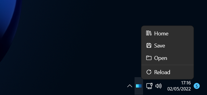
| NotifyIcon | Wpf.Ui.Controls | Icon with menu in the tray. |
| NumberBox | Wpf.Ui.Controls | Text field for entering numbers with the possibility of setting a mask. |
| ProgressRing | Wpf.Ui.Controls | Rotating loading ring like in Windows 11. |
| ThumbRate | Wpf.Ui.Controls | Buttons to leave positive or negative ratings. |
| Rating | Wpf.Ui.Controls | Stars to display the rating. |
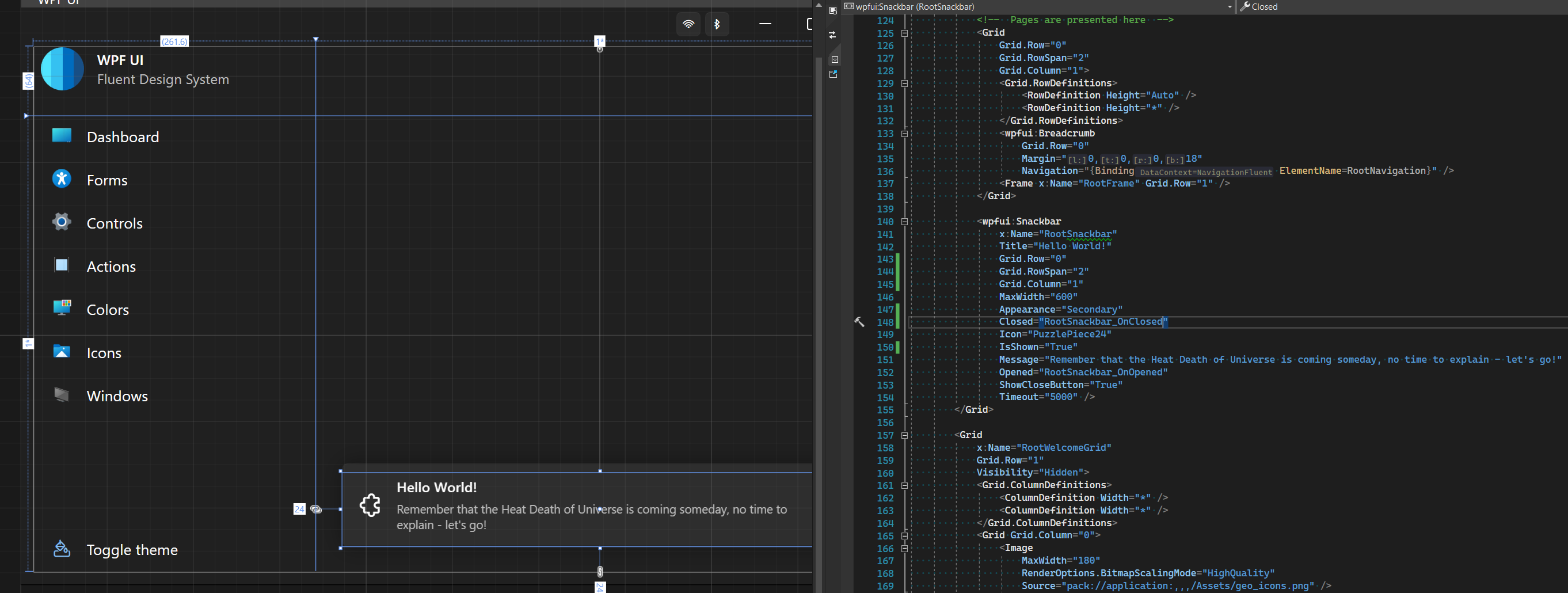
| Snackbar | Wpf.Ui.Controls | Animated card with a notification displayed at the bottom of the application. |
| ToggleSwitch | Wpf.Ui.Controls | Use ToggleSwitch to present users with two mutally exclusive options (like on/off). |
| TextBox | Wpf.Ui.Controls | Text field for with placeholders and icons. |
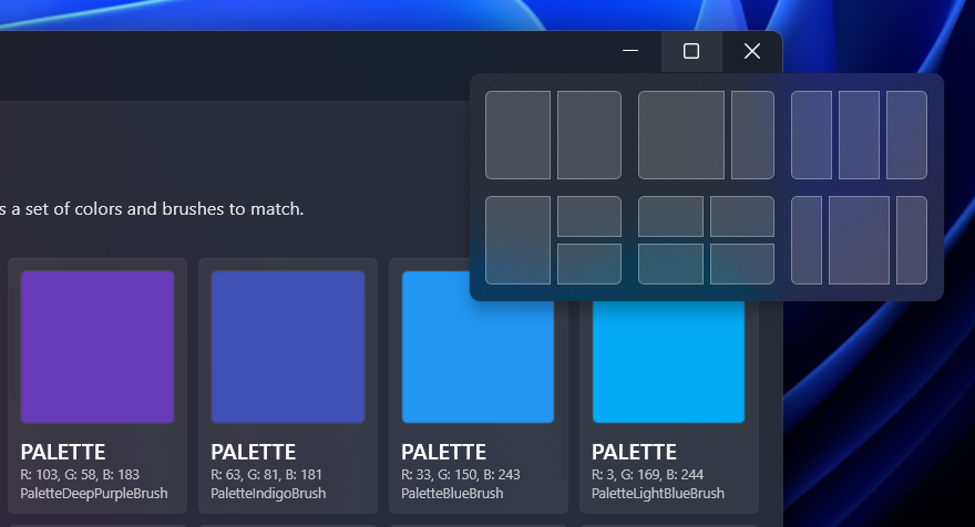
| TitleBar | Wpf.Ui.Controls | A set of buttons that can replace the default window navigation, giving it a new, modern look with implemented NotifyIcon. |
| Class | Namespace | Description |
|---|---|---|
| Theme | Wpf.Ui.Appearance | Allows to manage available color themes from the library. |
| Background | Wpf.Ui.Appearance | Allows to add background effects like Mica or Acrylic. |
| Accent | Wpf.Ui.Appearance | Allows to change the application color accents. |
| Watcher | Wpf.Ui.Appearance | Listens for changes in system parameters, then switches theme with Appearance.Theme.Set. |
| Progress | Wpf.Ui.Taskbar | Allows to change the status of the displayed notification in the application icon on the TaskBar. |
| NotifyIcon | Wpf.Ui.Tray | Allows to create an icon and a menu in the tray. |
Documentation can be found at https://wpfui.lepo.co/. We also have a tutorial over there for newcomers.
If you want to propose a new functionality or submit a bugfix, create a Pull Request for the branch development.
First, your application needs to load custom styles, add in the MyApp\App.xaml file:
<Application
  xmlns:ui="http://schemas.lepo.co/wpfui/2022/xaml">
  <Application.Resources>
    <ResourceDictionary>
      <ResourceDictionary.MergedDictionaries>
        <ui:ControlsDictionary />
        <ui:ThemesDictionary Theme="Dark" />
      </ResourceDictionary.MergedDictionaries>
    </ResourceDictionary>
  </Application.Resources>
</Application>
Now, you can customize your views, for example by adding a non-standard look to the main window and navigation buttons
<ui:UiWindow
  xmlns:ui="http://schemas.lepo.co/wpfui/2022/xaml"
  Style="{StaticResource UiWindow}">
  <Grid>
    <Grid.RowDefinitions>
      <RowDefinition Height="Auto" />
      <RowDefinition Height="*" />
    </Grid.RowDefinitions>

    <ui:TitleBar Grid.Row="0"/>

    <Grid Grid.Row="1" Margin="12,6,12,12">
      <Grid.ColumnDefinitions>
        <ColumnDefinition Width="Auto" />
        <ColumnDefinition Width="*" />
      </Grid.ColumnDefinitions>

      <ui:NavigationFluent Grid.Column="0" Margin="0,0,12,0" />

      <Frame Grid.Column="1" />
    </Grid>
  </Grid>
</ui:UiWindow>Crafting apps for .NET without the creators of tools like ReSharper or XAML Styler would never be such a fantastic adventure.
Design of the interface, choice of colors and the appearance of the controls were inspired by projects made by Microsoft for Windows 11.
The Wpf.Ui.Demo app includes icons from Shell32 for Windows 11. These icons are the legal property of Microsoft and you may not use them in your own app without permission. They are used here as an example of creating tools for Microsoft systems.
WPF UI uses Fluent System Icons. Although this font was also created by Microsoft, it does not contain all the icons for Windows 11. If you need the missing icons, add Segoe Fluent Icons to your application.
According to the EULA of Segoe Fluent Icons we cannot ship a copy of it with this dll. Segoe Fluent Icons is installed by default on Windows 11, but if you want these icons in an application for Windows 10 and below, you must manually add the font to your application's resources.
https://docs.microsoft.com/en-us/windows/apps/design/style/segoe-fluent-icons-font
https://docs.microsoft.com/en-us/windows/apps/design/downloads/#fonts
In the app dictionaries, you can add an alternate path to the font
<FontFamily x:Key="SegoeFluentIcons">pack://application:,,,/;component/Fonts/#Segoe Fluent Icons</FontFamily>Use Visual Studio 2022 and invoke the .sln.
Visual Studio
WPF UI is an Open Source project. You are entitled to download and use the freely available Visual Studio Community Edition to build, run or develop for WPF UI. As per the Visual Studio Community Edition license, this applies regardless of whether you are an individual or a corporate user.
This project has adopted the code of conduct defined by the Contributor Covenant to clarify expected behavior in our community.
WPF UI is free and open source software licensed under MIT License. You can use it in private and commercial projects.
Keep in mind that you must include a copy of the license in your project.


